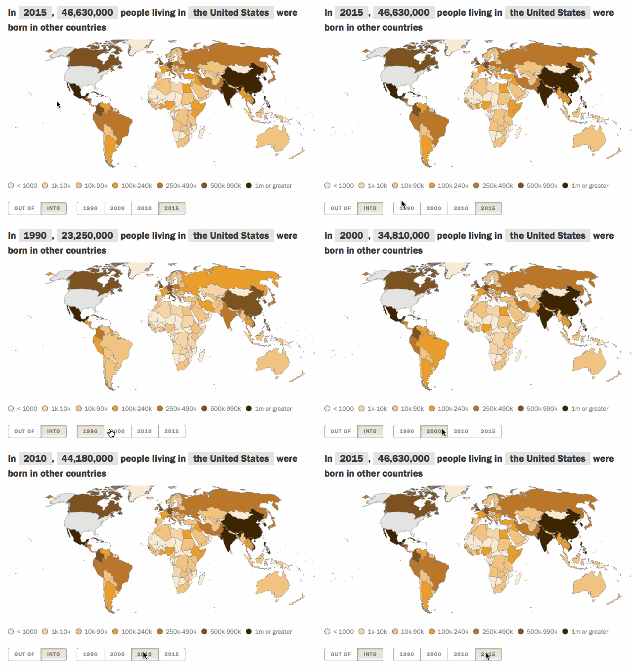
Global migration is no small-scale issue. If all of the world’s international migrants (people living in a country that is different from their country or territory of birth) lived in a single country, it would be the world’s fifth largest, with around 244 million people. The number and shares of people leaving and entering countries is different for each country of the world. (Explore our updated interactive map based on data from the United Nations Population Division.)
Here are five facts about how the U.S. compares with the rest of the world’s countries on migration.
By a wide margin, the U.S. has more immigrants than any other country in the world. As of 2015, the United Nations estimates that 46.6 million people living in the United States were not born there. This means that about one-in-five international migrants (19%) live in the U.S. The U.S. immigrant population is nearly four times that of the world’s next largest immigrant destination – Germany, with about 12 million immigrants.
(The UN’s figure of 46.6 million includes Puerto Ricans and others born in U.S. territories; they are not counted as immigrants by the U.S. Census Bureau or in most Pew Research Center publications. People born in Puerto Rico and U.S. territories are U.S. citizens at birth. Several other countries such as France, the United Kingdom and China also have territories and special administrative regions which the UN treats as distinct origins and destinations of international migrants.)
The U.S.-Mexico migration corridor is the world’s largest. Pew Research Center has extensively studied and attempted to quantify the historic migration route between the U.S. and Mexico. About 12 million people living in the U.S. were born in Mexico, according to UN estimates as of 2015. However, the migration trends between the U.S. and Mexico are changing. Recent Pew Research Center estimates show that more Mexicans are now leaving than coming to the U.S. As a point of comparison, the second largest corridor consists of Indian nationals living in the United Arab Emirates, estimated to be 3.5 million migrants.
Compared with other countries receiving immigrants, the share of the U.S. population that is foreign born is modest. About one-in-seven people living in the United States (14%) were born in other countries, a near-historic record. By way of comparison, about one-in-five people in Canada (22%) are foreign born. In Australia, it’s nearly three-in-ten people (28%). And in some Persian Gulf countries such as Qatar (75%) and United Arab Emirates (88%), the great majority of their resident populations are immigrants, many who have been actively recruited as foreign labor.
The U.S. immigrant population is not as diverse in origin as those of other countries. Even though the U.S. has immigrants from nearly every country of the world, it doesn’t have the most diverse pool of immigrants. The U.S. has a score of 91 on a 1-to-100 diversity index. By comparison, Denmark and the UK have some of the highest immigrant diversity scores (both 97), followed by Canada at 96. Roughly one-in-four (26%) immigrants in the U.S. come from just one country, Mexico. In several other destination countries (mainly in Europe), immigrants are not as concentrated from a single country or handful of them.
The U.S. has a lower number of emigrants – those who have left – than 19 other countries, including many with much smaller populations. More than 3 million people who were born in the U.S. now live in other countries, compared with nearly 16 million Indians who are emigrants. About 12 million Mexican-born people live outside of Mexico, mostly in the U.S. Even less-populated countries like Syria (5 million) and Poland (4.4 million) have larger emigrant populations. As a share of the population in 2015, around 1% of Americans born in the United States lived outside of the United States. This is a considerably smaller share than that of other migrant destinations like the UK (8%), Germany (5%) or Canada (4%).
To see how your country ranks with the rest of the world, check out our updated interactive map displaying the top countries of immigration and emigration since 1990.
