Barely 10 years past the end of the Great Recession in 2009, the U.S. economy is doing well on several fronts. The labor market is on a job-creating streak that has rung up more than 110 months straight of employment growth, a record for the post-World War II era. The unemployment rate in November 2019 was 3.5%, a level not seen since the 1960s. Gains on the jobs front are also reflected in household incomes, which have rebounded in recent years.
But not all economic indicators appear promising. Household incomes have grown only modestly in this century, and household wealth has not returned to its pre-recession level. Economic inequality, whether measured through the gaps in income or wealth between richer and poorer households, continues to widen.
Household incomes are growing again after a lengthy period of stagnation
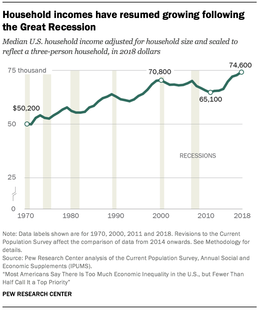
With periodic interruptions due to business cycle peaks and troughs, the incomes of American households overall have trended up since 1970. In 2018, the median income of U.S. households stood at $74,600.5 This was 49% higher than its level in 1970, when the median income was $50,200.6 (Incomes are expressed in 2018 dollars.)
But the overall trend masks two distinct episodes in the evolution of household incomes (the first lasting from 1970 to 2000 and the second from 2000 to 2018) and in how the gains were distributed.
Most of the increase in household income was achieved in the period from 1970 to 2000. In these three decades, the median income increased by 41%, to $70,800, at an annual average rate of 1.2%. From 2000 to 2018, the growth in household income slowed to an annual average rate of only 0.3%. If there had been no such slowdown and incomes had continued to increase in this century at the same rate as from 1970 to 2000, the current median U.S. household income would be about $87,000, considerably higher than its actual level of $74,600.
The shortfall in household income is attributable in part to two recessions since 2000. The first recession, lasting from March 2001 to November 2001, was relatively short-lived.7 Yet household incomes were slow to recover from the 2001 recession and it was not until 2007 that the median income was restored to about its level in 2000.
But 2007 also marked the onset of the Great Recession, and that delivered another blow to household incomes. This time it took until 2015 for incomes to approach their pre-recession level. Indeed, the median household income in 2015 – $70,200 – was no higher than its level in 2000, marking a 15-year period of stagnation, an episode of unprecedented duration in the past five decades.8
More recent trends in household income suggest that the effects of the Great Recession may finally be in the past. From 2015 to 2018, the median U.S. household income increased from $70,200 to $74,600, at an annual average rate of 2.1%. This is substantially greater than the average rate of growth from 1970 to 2000 and more in line with the economic expansion in the 1980s and the dot-com bubble era of the late 1990s.
Why economic inequality matters
Alternative estimates of economic inequality
Upper-income households have seen more rapid growth in income in recent decades
The growth in income in recent decades has tilted to upper-income households. At the same time, the U.S. middle class, which once comprised the clear majority of Americans, is shrinking. Thus, a greater share of the nation’s aggregate income is now going to upper-income households and the share going to middle- and lower-income households is falling.9
The share of American adults who live in middle-income households has decreased from 61% in 1971 to 51% in 2019. This downsizing has proceeded slowly but surely since 1971, with each decade thereafter typically ending with a smaller share of adults living in middle-income households than at the beginning of the decade.
The decline in the middle-class share is not a total sign of regression. From 1971 to 2019, the share of adults in the upper-income tier increased from 14% to 20%. Meanwhile, the share in the lower-income tier increased from 25% to 29%. On balance, there was more movement up the income ladder than down the income ladder.
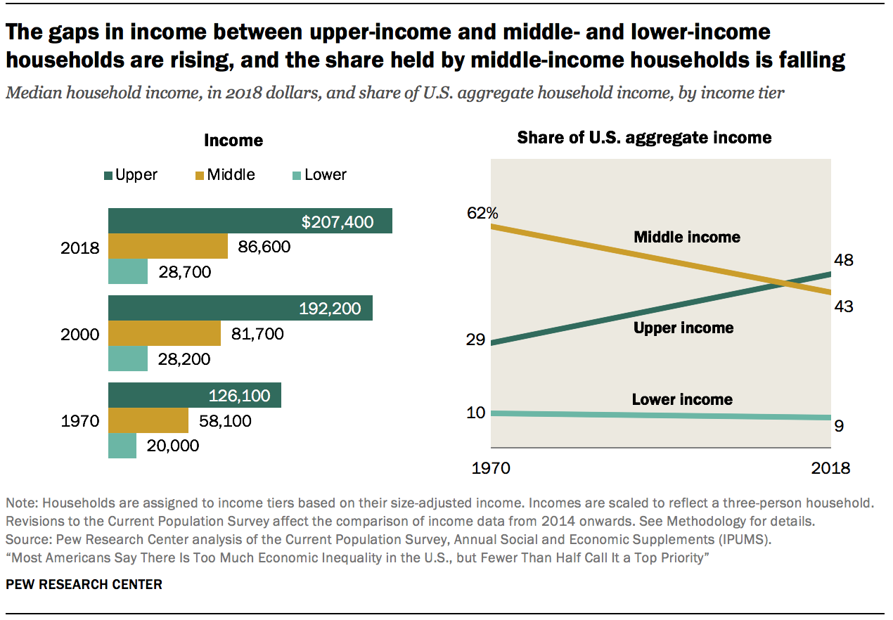
But middle-class incomes have not grown at the rate of upper-tier incomes. From 1970 to 2018, the median middle-class income increased from $58,100 to $86,600, a gain of 49%.10 This was considerably less than the 64% increase for upper-income households, whose median income increased from $126,100 in 1970 to $207,400 in 2018. Households in the lower-income tier experienced a gain of 43%, from $20,000 in 1970 to $28,700 in 2018. (Incomes are expressed in 2018 dollars.)
More tepid growth in the income of middle-class households and the reduction in the share of households in the middle-income tier led to a steep fall in the share of U.S. aggregate income held by the middle class. From 1970 to 2018, the share of aggregate income going to middle-class households fell from 62% to 43%. Over the same period, the share held by upper-income households increased from 29% to 48%. The share flowing to lower-income households inched down from 10% in 1970 to 9% in 2018.
These trends in income reflect the growth in economic inequality overall in the U.S. in the decades since 1980.
Income growth has been most rapid for the top 5% of families
Even among higher-income families, the growth in income has favored those at the top. Since 1980, incomes have increased faster for the most affluent families – those in the top 5% – than for families in the income strata below them. This disparity in outcomes is less pronounced in the wake of the Great Recession but shows no signs of reversing.
From 1981 to 1990, the change in mean family income ranged from a loss of 0.1% annually for families in the lowest quintile (the bottom 20% of earners) to a gain of 2.1% annually for families in the highest quintile (the top 20%). The top 5% of families, who are part of the highest quintile, fared even better – their income increased at the rate of 3.2% annually from 1981 to 1990. Thus, the 1980s marked the beginning of a long and steady rise in income inequality.
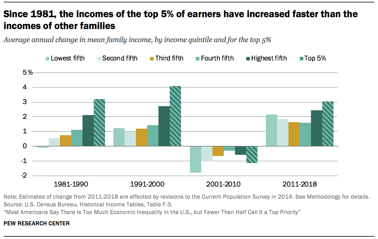
A similar pattern prevailed in the 1990s, with even sharper growth in income at the top. From 1991 to 2000, the mean income of the top 5% of families grew at an annual average rate of 4.1%, compared with 2.7% for families in the highest quintile overall, and about 1% or barely more for other families.
The period from 2001 to 2010 is unique in the post-WWII era. Families in all strata experienced a loss in income in this decade, with those in the poorer strata experiencing more pronounced losses. The pattern in income growth from 2011 to 2018 is more balanced than the previous three decades, with gains more broadly shared across poorer and better-off families. Nonetheless, income growth remains tilted to the top, with families in the top 5% experiencing greater gains than other families since 2011.
The wealth of American families is currently no higher than its level two decades ago
Other than income, the wealth of a family is a key indicator of its financial security. Wealth, or net worth, is the value of assets owned by a family, such as a home or a savings account, minus outstanding debt, such as a mortgage or student loan. Accumulated over time, wealth is a source of retirement income, protects against short-term economic shocks, and provides security and social status for future generations.
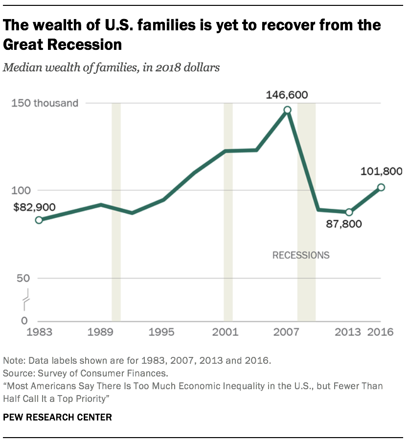
The period from the mid-1990s to the mid-2000s was beneficial for the wealth portfolios of American families overall. Housing prices more than doubled in this period, and stock values tripled.11 As a result, the median net worth of American families climbed from $94,700 in 1995 to $146,600 in 2007, a gain of 55%.12 (Figures are expressed in 2018 dollars.)
But the run up in housing prices proved to be a bubble that burst in 2006. Home prices plunged starting in 2006, triggering the Great Recession in 2007 and dragging stock prices into a steep fall as well. Consequently, the median net worth of families fell to $87,800 by 2013, a loss of 40% from the peak in 2007. As of 2016, the latest year for which data are available, the typical American family had a net worth of $101,800, still less than what it held in 1998.
The wealth divide among upper-income families and middle- and lower-income families is sharp and rising
The wealth gap among upper-income families and middle- and lower-income families is sharper than the income gap and is growing more rapidly.
The period from 1983 to 2001 was relatively prosperous for families in all income tiers, but one of rising inequality. The median wealth of middle-income families increased from $102,000 in 1983 to $144,600 in 2001, a gain of 42%. The net worth of lower-income families increased from $12,3oo in 1983 to $20,600 in 2001, up 67%. Even so, the gains for both lower- and middle-income families were outdistanced by upper-income families, whose median wealth increased by 85% over the same period, from $344,100 in 1983 to $636,000 in 2001. (Figures are expressed in 2018 dollars.)
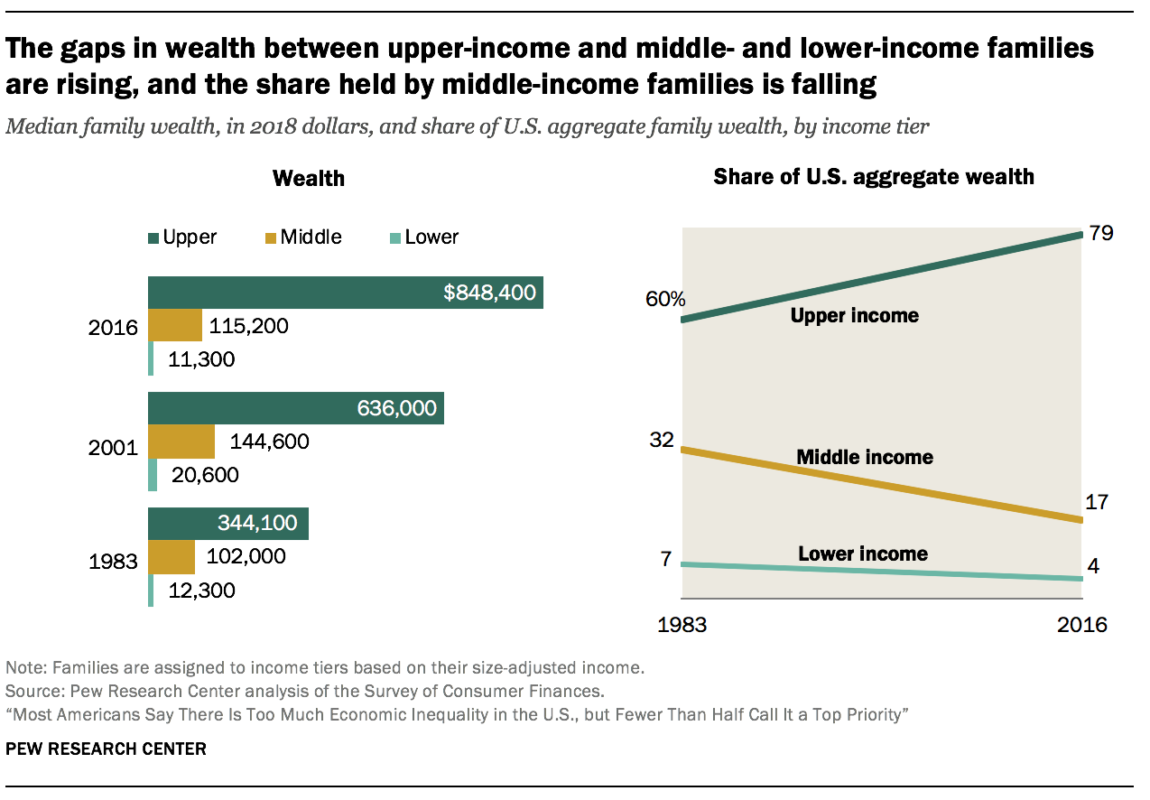
The wealth gap between upper-income and lower- and middle-income families has grown wider this century. Upper-income families were the only income tier able to build on their wealth from 2001 to 2016, adding 33% at the median. On the other hand, middle-income families saw their median net worth shrink by 20% and lower-income families experienced a loss of 45%. As of 2016, upper-income families had 7.4 times as much wealth as middle-income families and 75 times as much wealth as lower-income families. These ratios are up from 3.4 and 28 in 1983, respectively.
The reason for this is that middle-income families are more dependent on home equity as a source of wealth than upper-income families, and the bursting of the housing bubble in 2006 had more of an impact on their net worth. Upper-income families, who derive a larger share of their wealth from financial market assets and business equity, were in a better position to benefit from a relatively quick recovery in the stock market once the recession ended.
As with the distribution of aggregate income, the share of U.S. aggregate wealth held by upper-income families is on the rise. From 1983 to 2016, the share of aggregate wealth going to upper-income families increased from 60% to 79%. Meanwhile, the share held by middle-income families has been cut nearly in half, falling from 32% to 17%. Lower-income families had only 4% of aggregate wealth in 2016, down from 7% in 1983.
The richest are getting richer faster
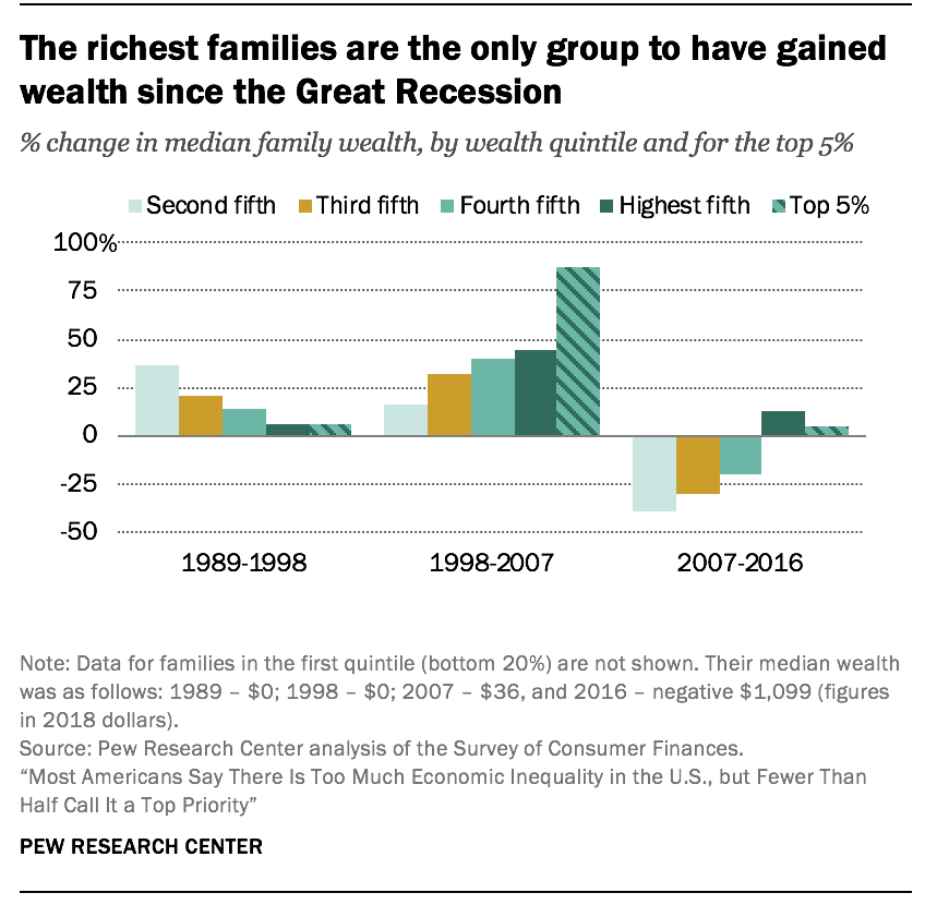
The richest families in the U.S. have experienced greater gains in wealth than other families in recent decades, a trend that reinforces the growing concentration of financial resources at the top.
The tilt to the top was most acute in the period from 1998 to 2007. In that period, the median net worth of the richest 5% of U.S. families increased from $2.5 million to $4.6 million, a gain of 88%.
This was nearly double the 45% increase in the wealth of the top 20% of families overall, a group that includes the richest 5%. Meanwhile, the net worth of families in the second quintile, one tier above the poorest 20%, increased by only 16%, from $27,700 in 1998 to $32,100 in 2007. (Figures are expressed in 2018 dollars.)
The wealthiest families are also the only ones to have experienced gains in wealth in the years after the start of the Great Recession in 2007. From 2007 to 2016, the median net worth of the richest 20% increased 13%, to $1.2 million. For the top 5%, it increased by 4%, to $4.8 million. In contrast, the net worth of families in lower tiers of wealth decreased by at least 20% from 2007 to 2016. The greatest loss – 39% – was experienced by the families in the second quintile of wealth, whose wealth fell from $32,100 in 2007 to $19,500 in 2016.
As a result, the wealth gap between America’s richest and poorer families more than doubled from 1989 to 2016. In 1989, the richest 5% of families had 114 times as much wealth as families in the second quintile, $2.3 million compared with $20,300. By 2016, this ratio had increased to 248, a much sharper rise than the widening gap in income.13
Income inequality in the U.S has increased since 1980 and is greater than in peer countries

Income inequality may be measured in a number of ways, but no matter the measure, economic inequality in the U.S. is seen to be on the rise.
One widely used measure – the 90/10 ratio – takes the ratio of the income needed to rank among the top 10% of earners in the U.S. (the 90th percentile) to the income at the threshold of the bottom 10% of earners (the 10th percentile). In 1980, the 90/10 ratio in the U.S. stood at 9.1, meaning that households at the top had incomes about nine times the incomes of households at the bottom. The ratio increased in every decade since 1980, reaching 12.6 in 2018, an increase of 39%.14
Not only is income inequality rising in the U.S., it is higher than in other advanced economies. Comparisons of income inequality across countries are often based on the Gini coefficient, another commonly used measure of inequality.15 Ranging from 0 to 1, or from perfect equality to complete inequality, the Gini coefficient in the U.S. stood at 0.434 in 2017, according to the Organization for Economic Cooperation and Development (OECD).16 This was higher than in any other of the G-7 countries, in which the Gini ranged from 0.326 in France to 0.392 in the UK, and inching closer to the level of inequality observed in India (0.495). More globally, the Gini coefficient of inequality ranges from lows of about 0.25 in Eastern European countries to highs in the range of 0.5 to 0.6 in countries in southern Africa, according to World Bank estimates.